How to install:
Speed Punk is open source software and can be installed free of charge from Glyphs.app’s built-in Plugin Manager or RoboFont Mechanic 2.
History
The Bézier curve was developed almost simultaneously by two Frenchmen working in computer aided design (CAD) in the French automobile industry in the early 1960s, Paul de Casteljau working for Citroën and Pierre Bézier working for Renault. De Casteljau is today attributed with the invention, but Citroën decided to keep his research secret until the late 1960s, hence they carry Bézier’s name.
The curves play an important role in industrial design, namely aqua- and aerodynamics, as well as computer animation (smoothly controlling the velocity of an object over time). And of course computer graphics in general and type design in particular, as they provide a memory efficient means of storing illustrations and can easily be scaled and rasterized on the fly for sharp printing on output devices with varying resolutions.
If you ever have to make a case for redesign, I’ve found Speed Punk a helpful tool in explaining drawing quality to non-designery people. It makes quick and easy infographics so you show clients why their old art sucks and your new art rules.
Without Bézier curves many things we take for granted wouldn’t be possible. Taking off in a roller coaster from the flat into a perfect circle loop would brake your spine, as the curvature would infinitely increase from the straight line to a fixed amount of curve speed in the circle. Or imagine the impossibility of your car’s steering wheel needing to be turned instantly by a fixed angle from the straight road into a curve. Instead, any moving object turns into a curve progressively, starting with no curvature and slowly increasing it over time.
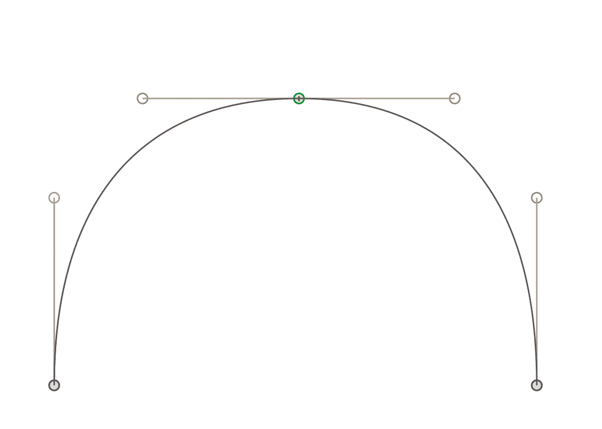
Curvature of cubic Bézier curves (the most commonly used form of the Bézier curves in computer graphics, also part of the PostScript language) is controlled by two off-curve points per curve segment commonly as ‘handles’ or ‘vectors’. Pulling one of them will influence the distribution of the curvature of the entire curve segment.
Any design more complex than a quarter circle will require the use of several consecutive curve segments, and this is especially true for letter forms. One of the problems the designer is confronted with is to distribute the curvature equally across two joining curve segments, across their shared on-curve point. If the curvature across this point is not continuous, one will see a smaller or bigger dent in the curve on either side of the shared on-curve point.
Continuous curvature is called G2 in mathematical terms as opposed to G1 continuity where two joining curves have a common tangent in the joining point but no continuous curvature, as opposed to G0 continuity where two curves join but have no common tangent, as opposed to no continuity at all (the curves don't even join).
Wikipedia says:
While it may be obvious that a curve would require G1 continuity to appear smooth, for good aesthetics, such as those aspired to in architecture and sports car design, higher levels of geometric continuity are required. For example, reflections in a car body will not appear smooth unless the body has G2 continuity.
Well, you don’t strictly need it. It’s just an analysis tool that amplifies and illuminates what is happening in your curves, particularly continuity at the junction of curve segments, making it easier to see where adjustments may be needed. It’s a way of seeing if your curves are really as smooth as you think they are.
A technical requirement of digital typefaces adds to the type designer’s problem: the necessity of adding on-curve points at the curves' extremes in both X and Y direction. It is (or was, as some voices say) necessary to speed up glyph arithmetics especially for making glyph bounding box calculation efficient and reliable. But those extremum points will unfortunately in many cases have to be positioned in shape-wise unnatural locations.
Take the construction of the letter ‘o’ mimicking a broad nib pen for instance. Wouldn’t it feel natural to position the on-curve points along the contrast axis for the counter or along a mirrored contrast axis for the outline? Instead we have to position the nodes horizontally and vertically in the most awkward spots. This poses the risk of discontinuous curvature.
Speed Punk illustrates the curvature on top of the outlines. This is a technique commonly known from CAD software. The bigger the illustration is, the higher the curvature is at this point. This way it is easy to judge curvature continuity at on-curve points: if the illustrations are of same distance from the on-curve point (they meet), the two curves are of continuous curvature. If you see a jump in the curvature illustration, curvature is discontinuous. Simple.
Another thing to judge other than continuous curvature across on-curve points is the distribution of curvature within curve segments: how lose or tight are the curves? While it is very hard to assess equal curvature on two opposing corners of an ‘o’, visually comparing the sizes of the curvature illustrations is much easier. As another visual aid, the illustrations’ colors are being interpolated between the highest and lowest measured curvature amounts for each glyph. When the two opposing corners of the ‘o’ have a similar color, their curvature amount is also similar.
All of this design trouble, however, will go away with increasing experience of the type designer. Which is why I call it a learning tool.
Still with Speed Punk we can observe some interesting anomalies of Bézier curves.
Have you ever wondered what the much talked about inflections actually are? We get taught that a curve’s one handle is not supposed to cross over the other handle’s imaginary continued direction, but why? What this actually means is that the curvature at some point in the curve segment inflects into the negative – the curve becomes an ‘s’ form. However small the amount is – if not intended it should be avoided. In Speed Punk this will show as the curvature illustration crossing over the outline into the other side (in Outer side of curve mode) or bounce back from the outline (in Outside of glyph mode).
There are exceptions, of course. One letter that is supposed to carry two inflections is – not surprisingly – the ‘s’.
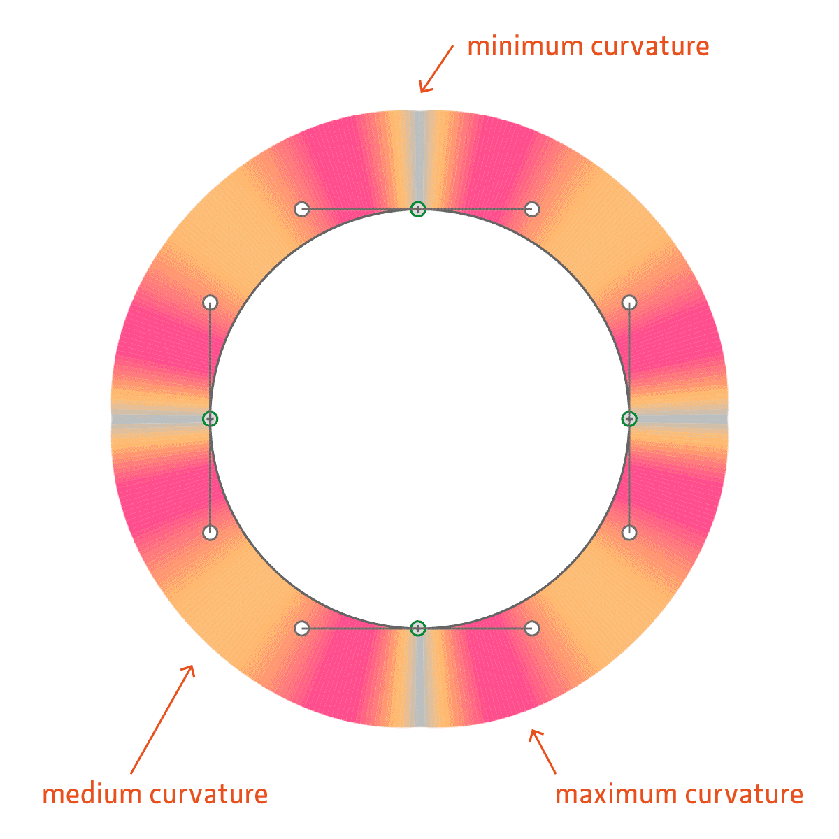
The other interesting observation is the curvature of a circle. It is known that with no amount of Bézier curve segments can a perfect circle be constructed. The lower the amount of segments, the less perfect the result. A normal circle’s radius constructed of four curve segments will deviate from the exact radius by a maximum of about 0,27 per mill according to my measurements. The curvature starts out at the on-curve point with its minimum, reaching a maximum (highest deviation from exact radius) at about 14 degrees angle, then going back to a lower curvature at 45 degrees, then repeating over in reverse until the end of the segment.
Speed Punk lends its name from the curve speed (another term for curvature) and the Mohawk-like shapes that illustrate the curvature on the letter outlines. And it suggests that it’s cool to draw curvature continuous Bézier curves.